Page 1 of 1
AI
Posted: Thu Feb 02, 2006 4:33 pm
by Spartan Sniper
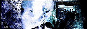
this is my first tech sig, i'm hate tech sigs but i decided to fool around
RnC
1 to 10
Posted: Thu Feb 02, 2006 4:58 pm
by RaVNzCRoFT
I don't see how it's tech; tech signatures traditionally have the white tech brushing. If what your name is on is tech brushing, make it a different color so we can make out what it looks like.
Posted: Thu Feb 02, 2006 5:03 pm
by Spartan Sniper
I brightened the picture so you can see the tech brushes

Posted: Thu Feb 02, 2006 5:21 pm
by RaVNzCRoFT
Well like I said, they're traditionally white. And there's no point in having them if you need to brighten the image to 50+ to see them.
Posted: Thu Feb 02, 2006 6:50 pm
by lxNicktardxl
RaVNzCRoFT wrote:Well like I said, they're traditionally white. And there's no point in having them if you need to brighten the image to 50+ to see them.
Yea. The updated one looks worse than the first one.
Posted: Thu Feb 02, 2006 8:07 pm
by Spartan Sniper
thats not an updated one
Posted: Thu Feb 02, 2006 8:57 pm
by Cuda
the dark ones better. brightening it made it worse.
Posted: Thu Feb 02, 2006 11:21 pm
by wes
that is not an updated one
he just brightened it to show the "tech"
Posted: Fri Feb 03, 2006 11:12 am
by Kurroda
it looks to grundgy to be a tech sig
Posted: Fri Feb 03, 2006 4:04 pm
by Cuda
wes wrote:the just brightened it to show the "tech"
Why does he need to show us? shouldnt we be able o tell it was a tech sig?
Posted: Fri Feb 03, 2006 6:03 pm
by wes
if you read the above posts, you would see ravn talking about how tech brushing is traditionally white, and how the brushing is too hard to see. in response, Spartan Sniper brightened the sig to show where the tech was.
Posted: Fri Feb 03, 2006 7:32 pm
by maca_§
The colours and the Render were a bad choice if you ask me :).