Page 1 of 1
spartan
Posted: Tue Jan 31, 2006 2:31 pm
by Spartan Sniper
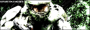
got bored
RnC
Posted: Tue Jan 31, 2006 2:39 pm
by RaVNzCRoFT
The contrast is very ugly. But I think this is the best job you've done on your text.
Posted: Tue Jan 31, 2006 4:59 pm
by Phosphorous
Sorta reminds me of my current...
Its overcontrasted though.
Posted: Tue Jan 31, 2006 5:13 pm
by Spartan Sniper
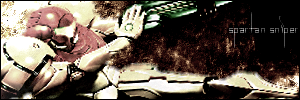
new one
Posted: Tue Jan 31, 2006 5:25 pm
by Phosphorous
I hate the text, and the colors are kinda wacked, but other than that it's a really cool sig.
Posted: Tue Jan 31, 2006 7:18 pm
by wes
Phosphorous wrote:I hate the text
Posted: Tue Jan 31, 2006 10:33 pm
by Cuda
stop with that wierd text.
Posted: Wed Feb 01, 2006 11:11 am
by lxNicktardxl
Cuda wrote:stop with that wierd text.
I think Ravn covered everything about the contrast
Posted: Wed Feb 01, 2006 6:38 pm
by Driv3r
looks cool but i dont like the text on the second one
On the first one, way to much contrast