Page 1 of 1
The song remains the same
Posted: Mon Jan 30, 2006 2:26 pm
by Spartan Sniper
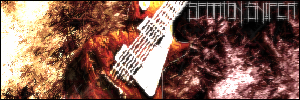
RnC
Posted: Mon Jan 30, 2006 3:15 pm
by lxNicktardxl
Kind of wierd...the strings are pixelated. The text is hard to read. Work on those...nice concept though.
Posted: Mon Jan 30, 2006 4:37 pm
by wes
i don't like the text
the backround looks nice
i don't like how the guitar is so... pixelated (especially the strings)
use a clearer font, and try and remove the white outline of the guitar
Posted: Mon Jan 30, 2006 4:37 pm
by Spartan Sniper
updated:
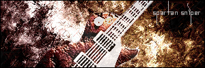
i like this one better

Posted: Mon Jan 30, 2006 4:39 pm
by wes
i think the white stands out too much. stop doing that with your name, i don't really like it. i like the backround, so i suggest a quote "rock on"
Posted: Mon Jan 30, 2006 4:39 pm
by Grave
I see you like Led Zeppelin and your using the Zeppelin font aswell is yours called Kashmir cuz i had the same one and thats what it was called
Posted: Mon Jan 30, 2006 4:46 pm
by Spartan Sniper
that is correct good sir
and wes i'll get to work on white outline problem and add that quote

Posted: Mon Jan 30, 2006 5:24 pm
by Spartan Sniper
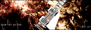
final update:
Posted: Mon Jan 30, 2006 5:32 pm
by RaVNzCRoFT
I kind of like that. It looks like half of the guitar is the backround's texture. But you seriously need to get new fonts, and work on text and effects. Text is hard. But you must work on it to improve it. Mess around with blending options.

Posted: Mon Jan 30, 2006 5:35 pm
by Spartan Sniper
thnx ravn