Page 1 of 1
MGS4 sig
Posted: Sun Jan 15, 2006 2:22 pm
by Spartan Sniper
well i took peoples advice, got some new brushes and this is what I made
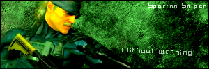
I like this one better than the other one
thx for the tips guys!
RnC
Posted: Sun Jan 15, 2006 7:15 pm
by Dr.Cox
well not much contrasts
no depth
not blended well
render sticks out and dosent match
text is fine
||||||||||
Posted: Mon Jan 16, 2006 5:05 am
by RaVNzCRoFT
It doesn't have much contrast or depth, but everything seems to be blended well. You just need to work on text and contrast.
7/10. I think this is your best yet.
Posted: Mon Jan 16, 2006 7:20 am
by lxNicktardxl
It looks like you overbrushed...most brushes shouldnt make it that (bundled) together, their should be some space where contrast can take some effect. IDK, I dont really like this one, I think I just dont like the way you blend your renders (its different).
5/10