Page 1 of 1
new sig part 2 in series
Posted: Wed Jan 11, 2006 5:05 pm
by Spartan Sniper
RnC
more on the way soon!
Posted: Wed Jan 11, 2006 5:14 pm
by wes
stop putting the render over the border
Posted: Wed Jan 11, 2006 5:32 pm
by RaVNzCRoFT
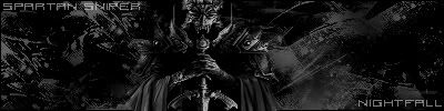
The text isn't too great, but at least it's readable now. I also don't like the color. I mean, it just seems too dark. It's like...complete blackness. lol
Nice, though. I like the feeling to it. 7/10.

Posted: Wed Jan 11, 2006 6:09 pm
by lxNicktardxl
COLOR!!! Also you dont have to make the sig so big. Make it so it fits the render with little space of "play".
Posted: Wed Jan 11, 2006 6:18 pm
by Phosphorous
Nice sig, maybe if it had some depth and better text...
I really like the atmosphere to it though, good job.
Posted: Wed Jan 11, 2006 9:02 pm
by maca_§
RaVNzCRoFT wrote:I like the feeling to it. 7/10.
I like it too, although colour wouldn't hurt

.