Page 1 of 1
New Signature - Doom
Posted: Sun Jan 08, 2006 12:28 am
by JK-47

Like it?
I love it, and i actually have decent font, and a regular boarder. (also, its not huge!)
Posted: Sun Jan 08, 2006 6:38 am
by RaVNzCRoFT
No depth, uneven border, bad text, and bad render quality.

Posted: Sun Jan 08, 2006 9:16 am
by lxNicktardxl
There is no contrast. No depth,

Posted: Sun Jan 08, 2006 11:07 am
by JK-47
Ok well to at this point i dont care about text, simply because every text i choose no one likes....... I just choose whatever text fits the signature, and what i like too. I would have done a doom font but the only one i had looked like uber crap.
and how is the boarder uneven?
Posted: Sun Jan 08, 2006 11:36 am
by RaVNzCRoFT
Look closely.
Don't just pencil around the signature, because that's how you miss spots. Just use the stroke feature.
Posted: Sun Jan 08, 2006 4:16 pm
by JK-47
i didnt pencil.
And your little drawing doesnt really show how its uneven... either that or i just dont understand it.
lxNicktardxl wrote:There is no contrast.
Well i know that, but its supposed to look like that, since the creatures came from hell everything is basicly just red and yellow for hellfire and its reflecting off of his shiny skin.
Posted: Sun Jan 08, 2006 4:26 pm
by RaVNzCRoFT
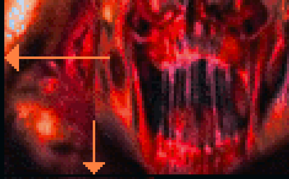
If you look at the line two pixels below the bottom of the arrow on the right, you can see that the bottom row wasn't colored in for the border.
Posted: Sun Jan 08, 2006 7:21 pm
by JK-47
OH OK! i see now, ill fix it later but now i have to write 2 storys for english

I tend to procrastinate a lot

Posted: Sun Jan 08, 2006 8:03 pm
by lxNicktardxl
It would probably look good if you feathered around the render. To blend it more.
Posted: Mon Jan 09, 2006 9:55 am
by wes

NOE U

Posted: Mon Jan 09, 2006 3:52 pm
by Lijitsu
wes wrote:
NOE U
ROFL!
Posted: Mon Jan 09, 2006 6:25 pm
by Phosphorous
This sig does need depth, and the hellknight appears to be discolored
.
But try to get some depth in there, then fix the font.
Posted: Mon Jan 09, 2006 8:00 pm
by maca_§
Phosphorous wrote:This sig does need depth, and the hellknight appears to be discolored
.
But try to get some depth in there, then fix the font.
'Fraid so.
Posted: Wed Jan 11, 2006 3:44 pm
by JK-47
Phosphorous wrote:This sig does need depth, and the hellknight appears to be discolored
.
But try to get some depth in there, then fix the font.
ugh, once again i have to explain.....
the hellnight is discolored because he is home...."Hell"
2nd, i have no idea what you guys mean by "give it depth", do you mean that i should magically push my hands through the screen and give it depth?
3rd, like ive said before, i like the text, its staying.
Sorry if im beeing an ass, all ive been doing from 2:10 to 12:00 every day of this week is studying and doing homework.
Posted: Wed Jan 11, 2006 4:08 pm
by Phosphorous
multi-genre wrote:Phosphorous wrote:This sig does need depth, and the hellknight appears to be discolored
.
But try to get some depth in there, then fix the font.
ugh, once again i have to explain.....
the hellnight is discolored because he is home...."Hell"
2nd, i have no idea what you guys mean by "give it depth", do you mean that i should magically push my hands through the screen and give it depth?
3rd, like ive said before, i like the text, its staying.
Sorry if im beeing an ****, all ive been doing from 2:10 to 12:00 every day of this week is studying and doing homework.
1. Its not bad to discolor something, but the Hellknight is badly discolored. His teeth look pink.
2. Depth can be achieved with more layers and better brushing. Adding contrast can help, too. Of course you cant push ur hands through the screen, dont be an ass.
3. You can leave the text, but it is ugly. Its pink and not blended at all.