Page 1 of 1
Another One w/ Tech Border
Posted: Thu Jan 05, 2006 8:24 am
by halobuddha
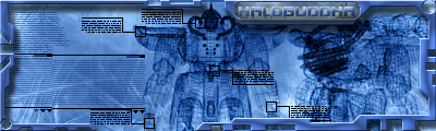
ok well i used the render i found and i messed w/ a couple of things so tell me What you think of it
Posted: Thu Jan 05, 2006 8:47 am
by Cuda
border is wayyy too overbeveled.
Posted: Thu Jan 05, 2006 8:54 am
by halobuddha
better?
Posted: Thu Jan 05, 2006 9:42 am
by Cuda
still kinda too much, what did you set the border at??
Posted: Thu Jan 05, 2006 10:25 am
by halobuddha
1 size
Posted: Thu Jan 05, 2006 10:39 am
by Cuda
take a screen shot.
Posted: Thu Jan 05, 2006 12:06 pm
by Phosphorous
That looks cool. Make it smaller though, I still think the sig itself is too big.
Posted: Thu Jan 05, 2006 1:43 pm
by halobuddha
CLICKY EL THUMBNAIL!
Posted: Thu Jan 05, 2006 3:29 pm
by RaVNzCRoFT
I personally think the border is too small and the signature overall is too big. Nobody wants to see that much free space taken up by just tech brushes (specifically the left side).
Posted: Thu Jan 05, 2006 4:37 pm
by halobuddha
i also thought it was too big but what do you think of the txt this time decent? or good enough? or not even?
Posted: Thu Jan 05, 2006 5:05 pm
by RaVNzCRoFT
I can't read it because of the bevel. I'd recommend giving it a size of 1, or 0 if possible (I forget).
Posted: Thu Jan 05, 2006 5:55 pm
by halobuddha
it is 1 and yeah i can see that it is kinda white
Posted: Thu Jan 05, 2006 8:11 pm
by maca_§
Seeing as the bevel is being nothing but a nuisance, I'd say remove it all together.
Edit: And the drop shadow.