Page 1 of 1
My attempt
Posted: Wed Jan 04, 2006 5:45 pm
by halobuddha
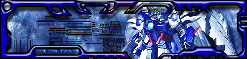
ok so i think the text is good bsides the fact that its kinda hard to read but neways just tell me what u think
Posted: Wed Jan 04, 2006 5:46 pm
by Phosphorous
no offense, but the border is kinda ugly. Lessen the bevel.
Posted: Wed Jan 04, 2006 5:47 pm
by BEEF!!!
Phosphorous wrote:no offense, but the border is kinda ugly. Lessen the bevel.
^^ Other than that it looks pretty good.
Posted: Wed Jan 04, 2006 5:50 pm
by halobuddha

better? i fixed up the text a bit 2
Posted: Wed Jan 04, 2006 5:59 pm
by Phosphorous
eh, Ive never been a fan of big, bulky tech borders. The sig seems a little long lengthwise, too.
Posted: Wed Jan 04, 2006 6:27 pm
by halobuddha
its max size 500x120
Posted: Wed Jan 04, 2006 7:26 pm
by wes
text is better in the fixed one (lmfao "fixed" stfu Infern0

)
but then again, the border is just so damn bulky
