Wanna show off your Sig/Avatar/artwork. Well this is the place to do it!
GametagAeonFlux
Posts: 9320 Joined: Sun Jun 06, 2004 7:27 pmLocation: Lincoln, NE
Post
by GametagAeonFlux Tue Jan 03, 2006 4:22 pm
Layer->New Adjustment Layer->Color Balance
Spartan Sniper
Posts: 497 Joined: Wed Nov 17, 2004 4:14 pm
Post
by Spartan Sniper Tue Jan 03, 2006 4:26 pm
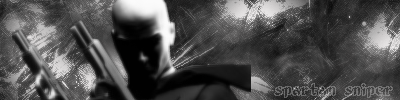
first off i made this in GIMP
second its a work in progress so i'll listen to your tips thanks
GametagAeonFlux
Posts: 9320 Joined: Sun Jun 06, 2004 7:27 pmLocation: Lincoln, NE
Post
by GametagAeonFlux Tue Jan 03, 2006 4:41 pm
Spartan Sniper wrote: first off i made this in GIMP
OH! I'm sorry then...those options are for Photoshop, you might want to go get a free trial of it over at
www.adobe.com
You'll get much better results.
lxNicktardxl
Posts: 995 Joined: Mon Sep 26, 2005 5:41 pmLocation: I get around...
Post
by lxNicktardxl Tue Jan 03, 2006 4:48 pm
Yea Spartan you definetley need some color to your sigs. All of them are in black and white.
Signature exceeded 75KB.
Spartan Sniper
Posts: 497 Joined: Wed Nov 17, 2004 4:14 pm
Post
by Spartan Sniper Tue Jan 03, 2006 4:52 pm
lxNicktardxl wrote: Yea Spartan you definetley need some color to your sigs. All of them are in black and white.
you know what your right i'm going to test with some things in GIMP and when i like it i'll post them here for opinions
Spartan Sniper
Posts: 497 Joined: Wed Nov 17, 2004 4:14 pm
Post
by Spartan Sniper Tue Jan 03, 2006 5:19 pm
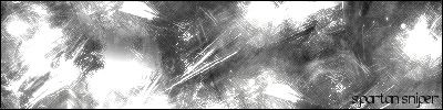
ok heres a new one which has a border because a lot of people have been telling me to add a border so i did it to shut them up
i still have to experiment with colors
Phosphorous
Posts: 1311 Joined: Fri Jul 09, 2004 10:44 amLocation: Installation 04
Contact:
Post
by Phosphorous Tue Jan 03, 2006 5:21 pm
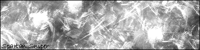
The text doesnt really go with the new one.
lxNicktardxl
Posts: 995 Joined: Mon Sep 26, 2005 5:41 pmLocation: I get around...
Post
by lxNicktardxl Tue Jan 03, 2006 5:56 pm
That kind of background would go GREAT with a gradient. Does GIMP have a gradient tool? If so, you should mess around with it.
Signature exceeded 75KB.
Spartan Sniper
Posts: 497 Joined: Wed Nov 17, 2004 4:14 pm
Post
by Spartan Sniper Tue Jan 03, 2006 6:00 pm
ya it does and i know how to use it and blend it in but my GIMP is outdated and i can't find the new GIMP so i can't do it
RaVNzCRoFT
Posts: 6208 Joined: Mon Jan 10, 2005 3:05 pmLocation: Raleigh, North Carolina, USA
Post
by RaVNzCRoFT Tue Jan 03, 2006 6:00 pm
Just what I was thinking
wes
Posts: 3839 Joined: Thu Apr 21, 2005 5:22 pm
Contact:
Post
by wes Tue Jan 03, 2006 6:31 pm
text = sux
Phosphorous
Posts: 1311 Joined: Fri Jul 09, 2004 10:44 amLocation: Installation 04
Contact:
Post
by Phosphorous Tue Jan 03, 2006 6:33 pm
Use a pixel font instead. It will look much better.
wes
Posts: 3839 Joined: Thu Apr 21, 2005 5:22 pm
Contact:
Post
by wes Tue Jan 03, 2006 6:33 pm
try visitor
wes
Posts: 3839 Joined: Thu Apr 21, 2005 5:22 pm
Contact:
Post
by wes Tue Jan 03, 2006 7:25 pm
.........
RaVNzCRoFT
Posts: 6208 Joined: Mon Jan 10, 2005 3:05 pmLocation: Raleigh, North Carolina, USA
Post
by RaVNzCRoFT Wed Jan 04, 2006 3:10 pm
...or 04b at size 8.


![[x]](http://img255.imageshack.us/img255/3713/fearck7.jpg)
![[x]](http://img246.imageshack.us/img246/8220/rb6vzo3.jpg)
![[x]](http://img504.imageshack.us/img504/7088/bustawolfrb3.jpg)