Hitmans Sig! Blended text and a quote!! <-------

Wanna show off your Sig/Avatar/artwork. Well this is the place to do it!
Post Reply
lxNicktardxl


Posts: 995
Joined: Mon Sep 26, 2005 5:41 pm
Location: I get around...

Hitmans Sig! Blended text and a quote!! <-------

Post by lxNicktardxl »

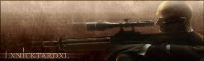
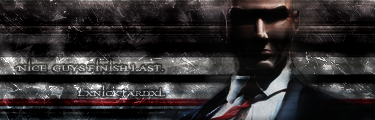
I actually blended the text messed with layer options curves and thought of a good quote for it. I like it much better then my old hitman sig here is the comparison.

OLD!:
Image

NEW!
Image

R&C!!
Signature exceeded 75KB.
The_Hushed_Casket


Posts: 1698
Joined: Sun Nov 07, 2004 12:13 pm

Post by The_Hushed_Casket »

Very nice, one of your best. It could use a border though, but it's really great.
Image
lxNicktardxl


Posts: 995
Joined: Mon Sep 26, 2005 5:41 pm
Location: I get around...

Post by lxNicktardxl »

It has a border but I guess its not visible, Ill change it and I want to add something also...
Signature exceeded 75KB.
User avatar
JK-47


Bloodhound Pyre Socialist Grunge

Posts: 10883
Joined: Wed Dec 01, 2004 2:54 pm
Location: Utah

Post by JK-47 »

Very nice Nicktard :D
Image
lxNicktardxl


Posts: 995
Joined: Mon Sep 26, 2005 5:41 pm
Location: I get around...

Post by lxNicktardxl »

I tried the border and it really made no difference. I tried some white scanlines on the background but that didnt help either. So Im gonna leave it how it is...

*waits patiently for Ravn's response*
Signature exceeded 75KB.
wes


Posts: 3839
Joined: Thu Apr 21, 2005 5:22 pm
Contact:

Post by wes »

i can see the border

try and start using 1 pix black stroke borders ;o
halobuddha


Posts: 834
Joined: Fri Oct 07, 2005 4:46 pm
Location: running around like a chicken w/o a head

Post by halobuddha »

nice! 8/10
Image
User avatar
Cuda


Grunge

Posts: 5725
Joined: Tue Oct 18, 2005 2:59 pm
Location: Torrance, CA

Post by Cuda »

wow. your work has gottem better by far 9/10.
Image
User avatar
RaVNzCRoFT


Grunge Pyre

Posts: 6208
Joined: Mon Jan 10, 2005 3:05 pm
Location: Raleigh, North Carolina, USA

Post by RaVNzCRoFT »

Nice on the pixel stretch, but the text is too hard to read. At least it doesn't stand out like a sore eye, but you'll want to fix it so you can read it.
Furiosa


Posts: 11
Joined: Mon Jan 02, 2006 11:03 am
Location: Canada
Contact:

Post by Furiosa »

Brushing is way too hard, text could be more professional, and border would do nicly.

Fur
Signature exceeded 3 lines of text.
Funsize


Posts: 9
Joined: Mon Jan 02, 2006 11:12 am

Post by Funsize »

well its not bad, i like the first one just add a boarder to em and make text a lil more readable
Sig exceeded 75000 bytes.
Post Reply