Page 1 of 2
Naota
Posted: Sat Dec 31, 2005 11:07 am
by The_Hushed_Casket
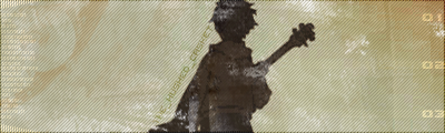
I'm probably going to use this sig for the SOTW. But its not quite finished, it needs something more. What do you guys think?
Posted: Sat Dec 31, 2005 11:17 am
by RaVNzCRoFT
I don't really like it, but I can't really put my finger on what I don't like. Maybe the emptiness?
Posted: Sat Dec 31, 2005 11:23 am
by The_Hushed_Casket
RaVNzCRoFT wrote:Maybe the emptiness?
Ya, I need something to fill it up.
Posted: Sat Dec 31, 2005 12:01 pm
by lxNicktardxl
Maybe some light brushes.
Posted: Sat Dec 31, 2005 12:05 pm
by RaVNzCRoFT
Fractals, mb?
Posted: Sat Dec 31, 2005 12:39 pm
by lxNicktardxl
RaVNzCRoFT wrote:Fractals, mb?
Whats that?
Posted: Sat Dec 31, 2005 12:47 pm
by wes

mb?
Posted: Sat Dec 31, 2005 12:53 pm
by JK-47
wes wrote:
mb?
no, this is one of those signatures that would look better without those.
Posted: Sat Dec 31, 2005 12:58 pm
by wes
i think the correct amount of black fractals would improve the sig
Posted: Sat Dec 31, 2005 12:58 pm
by RaVNzCRoFT
No, some gold-brown fractals would actually look very good to fill in that empty space.
Posted: Sat Dec 31, 2005 1:10 pm
by wes
this is what i got with black brushing

(no im not ripping his sig, im just demonstrating my theory)
Posted: Sat Dec 31, 2005 1:10 pm
by lxNicktardxl
wes wrote:
mb?
Are those fractals? Please someone show me some real ones or something.

Are fractuals like the brushes I used in my spiderman sig?
Posted: Sat Dec 31, 2005 1:11 pm
by wes
lxNicktardxl wrote: Are fractuals like the brushes I used in my spiderman sig?
yes
Posted: Sat Dec 31, 2005 1:12 pm
by lxNicktardxl
Ok then. Thanks. Yea you guys are right. Black would look good but also some brown would also look pretty sweet.

Posted: Sat Dec 31, 2005 2:06 pm
by The_Hushed_Casket
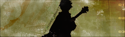
Here's what I got by darkening it a bit, I think it looks better. I didn't use fractals, just some light grunge brushes:
Posted: Sat Dec 31, 2005 2:43 pm
by lxNicktardxl
Just try fractals.

. Who knows it may make the sig the greatest ever.lol. Just go make a backup with fractals.
Posted: Sat Dec 31, 2005 2:53 pm
by The_Hushed_Casket
Is this better?
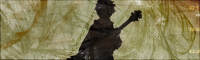
I really like the picture I used, but the sig isn't working out like I invisioned it.
Posted: Sat Dec 31, 2005 3:39 pm
by lxNicktardxl
There is just a lot of open space. Maybe close some and make the fractals a little bit less opaque.
Posted: Sat Dec 31, 2005 3:56 pm
by Patrickssj6
make the render bigger MB?
Posted: Sat Dec 31, 2005 4:02 pm
by RaVNzCRoFT
I think both the grunge and the fractals make it look a lot better. Maybe make the render bigger, but keep the brushing.