Visit remnantmods.com for more information
Skip to content
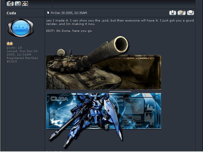
Post by Cuda » Fri Dec 30, 2005 4:52 am
Post by maca_§ » Fri Dec 30, 2005 5:17 am
Post by Cuda » Fri Dec 30, 2005 5:19 am
Post by The_Hushed_Casket » Fri Dec 30, 2005 12:15 pm
Post by lxNicktardxl » Fri Dec 30, 2005 2:41 pm
The_Hushed_Casket wrote:I like it. Nice use of the pop-out.
Post by maca_§ » Fri Dec 30, 2005 5:59 pm
lxNicktardxl wrote:A little dark but
Post by Cuda » Fri Dec 30, 2005 6:08 pm
Post by iDash » Mon Jan 02, 2006 9:48 am
Return to “GFX”