Page 1 of 1
Question. Then Sig.
Posted: Wed Dec 28, 2005 6:09 pm
by lxNicktardxl
Here is the Sig!!! I think I did a lot better. I actually put some effort to the text but I know "it could still use work". At least I tried. Which one?Here they are...
Black Scanlines

White Scanlines
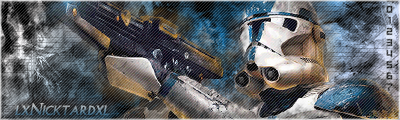
No Scanlines
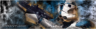
My border really isnt showing up great.

. The border looks good in Photoshop.

Posted: Wed Dec 28, 2005 9:57 pm
by maca_§
Get better text, that one really doesn't mix with the rest.
But other then that I would say your best yet and choose the one with the black scanlines.
Posted: Wed Dec 28, 2005 11:35 pm
by lxNicktardxl
Yea. It's Episode 1 font. I cant really tell.

.
I HATE DOING TEXTS!
^^^^^^^^^^^^^
That deserves to be in all caps.

Posted: Wed Dec 28, 2005 11:47 pm
by maca_§
So I've seen in your other topics :P.
I posted some useful links in one of your other topics so study them :D!
Posted: Thu Dec 29, 2005 2:28 am
by Cuda
depending on the sig, choose a font. If its a Grunge, go for a Grungy Block style font. If its tech, go get a tech font. a white w/ black stroke Pixel font wouldn't hurt either.
Posted: Thu Dec 29, 2005 6:32 am
by jks
Ive never been a fan of scan lines so I say the one without them is the best. Text is good but it still needs work.
Posted: Thu Dec 29, 2005 7:36 am
by Patrickssj6
jks wrote:Ive never been a fan of scan lines so I say the one without them is the best. Text is good but it still needs work.
same here
Posted: Thu Dec 29, 2005 9:02 am
by lxNicktardxl
I really just wanted to try scanlines. I used Cuda's AWESOME tut. Should it be my current?
Posted: Thu Dec 29, 2005 9:34 am
by Patrickssj6
fix text first
Posted: Thu Dec 29, 2005 9:54 am
by wes
jks wrote:Ive never been a fan of scan lines
neither have i, until i got a brush set with scanline brushes in em

Posted: Thu Dec 29, 2005 10:48 am
by jks
Yea I got those too... HEY! I get where your going I gave you my brushset didnt I? -_-
Yes current it. The one without scanlines.
Posted: Thu Dec 29, 2005 11:38 am
by wes
noe, its from a VPDESIGNS brushpack

Posted: Thu Dec 29, 2005 12:33 pm
by Spartan Sniper
[quote="maca_
Posted: Thu Dec 29, 2005 1:25 pm
by JK-47
Once again i dont think text is a very important factor in a signature, all i care about is that it looks good and this sig, looks GREAT!!
anyways i like the text he picks.
you all look for the least important things such as a boarder and text (boarders are semi-important) and you drop the rating because of these little things. it really just makes me mad.
Posted: Thu Dec 29, 2005 1:36 pm
by The_Hushed_Casket
multi-genre wrote:Once again i dont think text is a very important factor in a signature, all i care about is that it looks good and this sig, looks GREAT!!
anyways i like the text he picks.
you all look for the least important things such as a boarder and text (boarders are semi-important) and you drop the rating because of these little things. it really just makes me mad.
You said it yourself, all you care about is that it looks good. Text and border are factors in that 'look' as much as anything else.
Posted: Thu Dec 29, 2005 4:23 pm
by Cuda
well, you dont have to have scanlines over the whole thing, use the magic wand tool, go to the background layer, click in an area, go to the scanline layer and Edit-> fill in scanlines or dots. If you look at my SOTW entry, youll see that the dots arent covering the WHOLE sig only parts of it. you might wanna try that.
Re: Question. Then Sig.
Posted: Thu Dec 29, 2005 6:06 pm
by RaVNzCRoFT
lxNicktardxl wrote:My border really isnt showing up great.
. The border looks good in Photoshop.
That's because of the black box around your document in PShop. I'm sure they'll be visible on a darker skin.
Cool signatures. The scanlines add a nice touch, but I don't really think they fit the theme. So I'd say the original.
