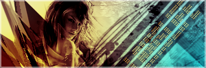
My "Bored" sig.

Wanna show off your Sig/Avatar/artwork. Well this is the place to do it!
Post Reply
lxNicktardxl


Posts: 995
Joined: Mon Sep 26, 2005 5:41 pm
Location: I get around...

My "Bored" sig.

Post by lxNicktardxl »

Image
Wow the bottom text came out pretty bad. :lol:
Signature exceeded 75KB.
halobuddha


Posts: 834
Joined: Fri Oct 07, 2005 4:46 pm
Location: running around like a chicken w/o a head

Post by halobuddha »

bad choice of render it doesn't go well with the bground blue goes really bad with dat red
Last edited by halobuddha on Thu Dec 15, 2005 6:13 pm, edited 1 time in total.
Image
wes


Posts: 3839
Joined: Thu Apr 21, 2005 5:22 pm
Contact:

Post by wes »

colors r teh sux
User avatar
RaVNzCRoFT


Grunge Pyre

Posts: 6208
Joined: Mon Jan 10, 2005 3:05 pm
Location: Raleigh, North Carolina, USA

Post by RaVNzCRoFT »

The fact that you only stretched the red part from Mario's hat was a bad mistake. The colors totally clash. If you had stretched the entire render across the signature, however, it may have looked better.
Last edited by RaVNzCRoFT on Thu Dec 15, 2005 6:19 pm, edited 1 time in total.
halobuddha


Posts: 834
Joined: Fri Oct 07, 2005 4:46 pm
Location: running around like a chicken w/o a head

Post by halobuddha »

RaVNzCRoFT wrote:The fact that you only stretched the red part from Mario's hat was a bad mistake. The colors totally clash. If you had stretch the entire render across the signature, however, it may have looked better.


i agree entirely
Image
lxNicktardxl


Posts: 995
Joined: Mon Sep 26, 2005 5:41 pm
Location: I get around...

Post by lxNicktardxl »

Oh man... :cry: Another failure.*runs away crying*.
Signature exceeded 75KB.
User avatar
RaVNzCRoFT


Grunge Pyre

Posts: 6208
Joined: Mon Jan 10, 2005 3:05 pm
Location: Raleigh, North Carolina, USA

Post by RaVNzCRoFT »

Dude, it's not a failure. If that's how you see it, you'll never be successful. A signature isn't a final product; it's not a crime to go back and change things. This isn't a final copy, it's a skeleton. Consider our constructive criticism. Go back into Photoshop and experiment. Try to make it better than it already is.
lxNicktardxl


Posts: 995
Joined: Mon Sep 26, 2005 5:41 pm
Location: I get around...

Post by lxNicktardxl »

lol. I know but I am trying to use a gradient because I guess I use Pixel Stretch too much. To make a long story short. I suck at gradients.

Also, I HATE picking renders.
Signature exceeded 75KB.
User avatar
RaVNzCRoFT


Grunge Pyre

Posts: 6208
Joined: Mon Jan 10, 2005 3:05 pm
Location: Raleigh, North Carolina, USA

Post by RaVNzCRoFT »

Go to GameRenders. They have some pretty good renders. If you can keep a frequent post rate, you can even view the best renders on the site. I usually don't know what render I'm going to use. I'll make a backround, browse the renders section, find a cool one, paste it in, and color the backround to that render. Or I'll choose one from my Halo Center Render Pack. :D
wes


Posts: 3839
Joined: Thu Apr 21, 2005 5:22 pm
Contact:

Post by wes »

User avatar
Cuda


Grunge

Posts: 5725
Joined: Tue Oct 18, 2005 2:59 pm
Location: Torrance, CA

Post by Cuda »

wow. just wow. the colors remind me of when you buy one of those Icees and the colors melt together, just icky. mario and a funky background. Just bad choice.
Image
User avatar
maca_§


Grunge

Posts: 5357
Joined: Mon Jan 19, 2004 8:54 pm
Location: Australia
Contact:

Post by maca_§ »

lol, yeah, choose better text/etc next time :).
  • Image
Post Reply