Page 1 of 1
My latest sig(next SOTM entry mb)
Posted: Tue Dec 13, 2005 5:45 pm
by Cuda

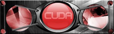
Plz Rate...This might be my next SOTM entry(IF we ever have one again...)but I might modify it for the SOTM.
I made a matching av for it too.

plz rate.
Posted: Tue Dec 13, 2005 5:47 pm
by halobuddha
oooh oooh oooh 9/10 i like it a lot you got my vote cuda

Posted: Tue Dec 13, 2005 5:58 pm
by Patrickssj6
I like it.Inovative

Posted: Tue Dec 13, 2005 6:00 pm
by a_marine
looks nice. nice mech style and I like the avatar more.
Posted: Tue Dec 13, 2005 6:18 pm
by wes
the middle looks a little roughed up, also the chainlike things could be better
i love the avatar tho, nice work
Posted: Tue Dec 13, 2005 6:49 pm
by BEEF!!!
Sorry, take down the avatar. 10295 bytes
Too big
Posted: Tue Dec 13, 2005 6:53 pm
by Cuda
youre gonna ding me on .05 over the KB limit!?
Posted: Tue Dec 13, 2005 6:59 pm
by wes
BEEF!!! is BEEF!!!....
Posted: Tue Dec 13, 2005 7:12 pm
by Phosphorous
Nice, I like it.
People need to start making more sigs like this, original and dont spammify brushes.
Kudos Cuda.
Posted: Tue Dec 13, 2005 7:13 pm
by BEEF!!!
Cuda wrote:youre gonna ding me on .05 over the KB limit!?
Sorry man, If I make an exception for you I gotta make exceptions for everyone else.
Posted: Tue Dec 13, 2005 7:25 pm
by a_marine
lol .05 kb but at least the rules are being followed.
Posted: Wed Dec 14, 2005 1:29 pm
by Patrickssj6
OMG Beef is right!If you don't take of that avatar my site take 0.00005 secs more to load!Can you expect something like that from me?
And BTW BEEF if you would't have said that it is over the limit i would never have known
Posted: Wed Dec 14, 2005 2:02 pm
by Cuda
man, I really dont wanna change the file type.... the png made the edges crisp, but the gif(a_Marines) gives it rough edges.
Posted: Wed Dec 14, 2005 2:07 pm
by RaVNzCRoFT
You did a pretty good job following that tutorial, but the glare on the orb is messed up. 7/10. And it's not likely that there will be a next SOTW/SOTM.
Posted: Wed Dec 14, 2005 3:58 pm
by JK-47
i think it would win
Posted: Thu Dec 15, 2005 3:13 pm
by Cuda
Ok, I made some changes. the most notable (unless color blind or have a crappy monitor), its red. and instead of the cables trailing off, I fixed them so the loop around the holes instead of going out of view.
Posted: Thu Dec 15, 2005 3:19 pm
by lxNicktardxl
I like the wires on the red one but I overall like the blue one more.
Posted: Thu Dec 15, 2005 3:59 pm
by RaVNzCRoFT
Red one's effects are the best, but just make it the same color as the blue one. The blue is blended more. Also, try to fix the pixelated areas surrounding the center orb.
Posted: Thu Dec 15, 2005 4:10 pm
by Cuda
actually, its the filetype that does that, Ill send you the psd so you can see for yourself. theres really nothing I can do if the edges are pixely. its really smooth in psd and high png form.