Wanna show off your Sig/Avatar/artwork. Well this is the place to do it!
Sarb
Posts: 1225 Joined: Tue Aug 23, 2005 11:51 amLocation: Canada
Post
by Sarb Tue Aug 14, 2007 4:50 pm
The blue seems really odd.
Your current sigs are much better IMO.
This is fine though
-DeToX-
Posts: 4589 Joined: Sun Jun 18, 2006 3:58 pmLocation: ...
Post
by -DeToX- Tue Aug 14, 2007 4:56 pm
Over his top left shoulder where the light is stronger and it blurs, more to the right it just cuts off, looks kind of weird, make the lighting flow more.
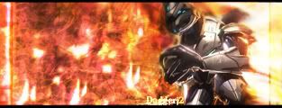
Dagger13
Posts: 370 Joined: Wed Nov 22, 2006 12:37 pm
Post
by Dagger13 Tue Aug 14, 2007 4:59 pm
its kind of old but its still is goodYeah I haven't made another sig in a while. And I didn't feel like getting mine rated again so I editted your post. ;P ~DeToX
(An Old one.)
DRL333
Posts: 1668 Joined: Wed Jul 05, 2006 6:49 pmLocation: Building more Turalbots!
Post
by DRL333 Tue Aug 14, 2007 5:36 pm
Looks ok, I like the blue side.
Valve > Bungie
Making abstract graphics again and better than ever!
noscottno
Posts: 2175 Joined: Thu Aug 10, 2006 7:33 pmLocation: Sacramento, CA
Contact:
Post
by noscottno Tue Aug 14, 2007 5:39 pm
I like it. Mostly the colors are the best part.
linkinparkbx
Posts: 67 Joined: Tue Aug 30, 2005 8:46 amLocation: NewYork, Bronx P
Contact:
Post
by linkinparkbx Tue Aug 14, 2007 5:49 pm
interesting...
iGeo wrote: What's a 'Wall Mart'?
DRL333
Posts: 1668 Joined: Wed Jul 05, 2006 6:49 pmLocation: Building more Turalbots!
Post
by DRL333 Tue Aug 14, 2007 5:52 pm
Heh, I remember making that, the shadow got fucked up.
Valve > Bungie
Making abstract graphics again and better than ever!
Umbral
Posts: 273 Joined: Sun Oct 09, 2005 7:11 amLocation: Total Posts 9,324,971,126,543.2
Contact:
Post
by Umbral Tue Aug 14, 2007 9:09 pm
Looks interesting i like it. Polygons
FTW
DarkShallFall
Posts: 1992 Joined: Fri Jan 20, 2006 2:49 pmLocation: MI, USA
Contact:
Post
by DarkShallFall Wed Aug 15, 2007 8:19 am
Lacks color but its nice.
Iron_Forge wrote: I assume I won?..I should get an emblem...
Sarb
Posts: 1225 Joined: Tue Aug 23, 2005 11:51 amLocation: Canada
Post
by Sarb Wed Aug 15, 2007 8:23 am
It looks good, but not scottys best
coz its not MY sig ;p
youhoo7
Posts: 1021 Joined: Fri Oct 27, 2006 2:53 pm
Post
by youhoo7 Wed Aug 15, 2007 8:49 am
i like the simplisity of urs....
We
JK-47
Posts: 10883 Joined: Wed Dec 01, 2004 2:54 pmLocation: Utah
Post
by JK-47 Wed Aug 15, 2007 8:59 am
It's alright
Note to next user: My sig is on a rotator, so please specify which one you are rating.
youhoo7
Posts: 1021 Joined: Fri Oct 27, 2006 2:53 pm
Post
by youhoo7 Wed Aug 15, 2007 9:01 am
its that one sig with the spartan thingy, it looks cool and i like the colors
We
DRL333
Posts: 1668 Joined: Wed Jul 05, 2006 6:49 pmLocation: Building more Turalbots!
Post
by DRL333 Wed Aug 15, 2007 9:02 am
Remindes me of toothpaste for some reason.
Valve > Bungie
Making abstract graphics again and better than ever!
JK-47
Posts: 10883 Joined: Wed Dec 01, 2004 2:54 pmLocation: Utah
Post
by JK-47 Wed Aug 15, 2007 9:07 am
Awesome. It's my favorite sig by you.
Umbral
Posts: 273 Joined: Sun Oct 09, 2005 7:11 amLocation: Total Posts 9,324,971,126,543.2
Contact:
Post
by Umbral Wed Aug 15, 2007 9:16 am
Its the one that says H.I.M. its alright blends nicely.
Sarb
Posts: 1225 Joined: Tue Aug 23, 2005 11:51 amLocation: Canada
Post
by Sarb Wed Aug 15, 2007 10:09 am
Nicce stock and nice adjustments.
-Legendary-
Posts: 2272 Joined: Mon Aug 02, 2004 8:06 pmLocation: SC
Contact:
Post
by -Legendary- Wed Aug 15, 2007 10:11 am
Avatar is really nice. Colors are swoot too.
Rate
Umbral
Posts: 273 Joined: Sun Oct 09, 2005 7:11 amLocation: Total Posts 9,324,971,126,543.2
Contact:
Post
by Umbral Wed Aug 15, 2007 10:55 am
Cool effects, I like the blue try and make it a little smaller though, it would look really good.
JK-47
Posts: 10883 Joined: Wed Dec 01, 2004 2:54 pmLocation: Utah
Post
by JK-47 Wed Aug 15, 2007 11:40 am
I really like the master chief part, but I don't like how the arbiter intrudes on it. It looks nice, though
Note to next user: My sig is on rotation, tell me which one you're rating please.


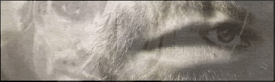
 (An Old one.)


