Actually, it looks fairly nice. Maybe make the text a little less noticeable. Could I see it without the texture as well? Also just for your knowledge, its suggestion.
ok, thanks guys, the thing is, I forgot to save it as a .psd but thanks for the comments. I'll keep it in mind when I make a new sig for a clan im guna join sooner or later.
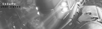
i think it could have had more color and better lighting and maybe the flow more near the focal point as the others said as well text and border could be worked on and i dun really like the horizontal lines but none the less its an ok sig


