Wanna show off your Sig/Avatar/artwork. Well this is the place to do it!
Dr.Cox
Posts: 4027 Joined: Fri Jun 24, 2005 5:48 pmLocation: Beaverton, Oregon.
Contact:
Post
by Dr.Cox Tue Jun 26, 2007 6:42 am
Update
Not removing this 'till I get back. Leaving on [01/05/09]
Tural
Posts: 15628 Joined: Thu Jun 16, 2005 3:44 pmLocation: Lincoln, NE
Contact:
Post
by Tural Tue Jun 26, 2007 6:59 am
Awesome.
-DeToX-
Posts: 4589 Joined: Sun Jun 18, 2006 3:58 pmLocation: ...
Post
by -DeToX- Tue Jun 26, 2007 7:07 am
Armed Civilian wrote: Update
Nice job. Keep it up.
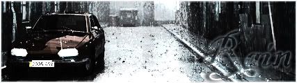
xlRainlx
Posts: 852 Joined: Thu Oct 05, 2006 8:30 pmLocation: Spirit of Fire Gamertag: Mal Vulcan
Contact:
Post
by xlRainlx Tue Jun 26, 2007 7:16 am
Very nice. That movie kicked arse too.
youhoo7
Posts: 1021 Joined: Fri Oct 27, 2006 2:53 pm
Post
by youhoo7 Tue Jun 26, 2007 7:19 am
the update was great...but i still think the left side needs something...maby a realy cool looking red texter...that blends into blew the more to the right it gets..
We
-DeToX-
Posts: 4589 Joined: Sun Jun 18, 2006 3:58 pmLocation: ...
Post
by -DeToX- Tue Jun 26, 2007 7:26 am
youhoo7 wrote: the update was great...but i still think the left side needs something...maby a realy cool looking red texter...that blends into blew the more to the right it gets..
We'll if he were to add an object to the black now, I think it would look worse. The simplicity is fine. I say leave it.
youhoo7
Posts: 1021 Joined: Fri Oct 27, 2006 2:53 pm
Post
by youhoo7 Tue Jun 26, 2007 7:32 am
but the left is too simplistic
We
Dr.Cox
Posts: 4027 Joined: Fri Jun 24, 2005 5:48 pmLocation: Beaverton, Oregon.
Contact:
Post
by Dr.Cox Tue Jun 26, 2007 9:30 am
Update.. i dont know aboutthis one hmmm
Not removing this 'till I get back. Leaving on [01/05/09]
xlRainlx
Posts: 852 Joined: Thu Oct 05, 2006 8:30 pmLocation: Spirit of Fire Gamertag: Mal Vulcan
Contact:
Post
by xlRainlx Tue Jun 26, 2007 9:53 am
i think it looks better when it's simple.
Patrickh
Posts: 1173 Joined: Wed Mar 14, 2007 4:53 pm
Post
by Patrickh Tue Jun 26, 2007 10:10 am
I definately agree
conure says: or i could jsut incase my shoes in papar mache, followed by my dog
|||
Lethargy |||
Mr. Mohawk |||
|||feel free to contact me via PMs, AIM, MSNM, or Xfire if you have any questions|||
youhoo7
Posts: 1021 Joined: Fri Oct 27, 2006 2:53 pm
Post
by youhoo7 Tue Jun 26, 2007 9:34 pm
im sorry...but i like it better that way...there was too much differance between the sides befor..now it is easier on the eyes
We
gh0570fchurch
Posts: 3374 Joined: Sat Oct 01, 2005 11:04 amLocation: San Diego Area, CA
Contact:
Post
by gh0570fchurch Tue Jun 26, 2007 9:36 pm
I don't like it with the mountains in the background. I love v2, though. I say you keep that one.
Dr.Cox wrote: gh0570fchurch has a mexi-stash. =D
-DeToX-
Posts: 4589 Joined: Sun Jun 18, 2006 3:58 pmLocation: ...
Post
by -DeToX- Wed Jun 27, 2007 8:56 am
-DeToX- wrote: We'll if he were to add an object to the black now, I think it would look worse. The simplicity is fine. I say leave it.
My words followed through, I like it more simple.
DRL333
Posts: 1668 Joined: Wed Jul 05, 2006 6:49 pmLocation: Building more Turalbots!
Post
by DRL333 Wed Jun 27, 2007 8:58 am
I like v3 the best, great job.
Valve > Bungie
Making abstract graphics again and better than ever!
SHOUTrvb
Posts: 3934 Joined: Sun Feb 13, 2005 11:13 am
Contact:
Post
by SHOUTrvb Wed Jun 27, 2007 9:55 am
Pretty awesome. At first I thought you were just doing a screen-edit, but this looks really nice.
Dr.Cox
Posts: 4027 Joined: Fri Jun 24, 2005 5:48 pmLocation: Beaverton, Oregon.
Contact:
Post
by Dr.Cox Wed Jun 27, 2007 5:55 pm
Thanks
any more commets?
Not removing this 'till I get back. Leaving on [01/05/09]


