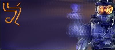
ok,so the little duhicky in the upper left corner..that is my new sighn..any ways....this is a sig i made after looking at some tuts ...tell what you think.
its ok..your entiteled to you opinion..and i respect it..but when you say something like that..tell me exactly the things that are wrong with it..not just the whole thing in general
Its pretty much the entire thing that i don't like. The render doesn't blend well, cortana is cut in half, your sign could be better blended, and the background doesn't seem to fit anything.
It's an improvement from your other stuff. But still, not that great. I dunno what to suggest to improve it. Honestly, I don't think there's any room for improvement.
But like I said, it's better than your other stuff. Keep reading up on some tuts, you'll get better .
Yeah, you are getting better, but it's just...unappealing, nothing blends, and there is too much open space. But don't let that get you down, keep going at it, we all start out like this, you'll get better.