
 just tell me what you think..compare it with my other work and tell me what you think..i like the black and white look and that why i did it in black and white.
youhoo7...new
youhoo7...new
just tell me what you think..compare it with my other work and tell me what you think..i like the black and white look and that why i did it in black and white.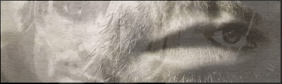
We

You use GIMP right? Probably your best, but would've looked better in color (In my opinion). Text doesn't have to be so huge either; It's too jagged. You're getting better.
Oh, and I found a few GIMP Tutorials for you:
DRAGON_MASTER224 @ Nintendo.com (I recommend making your own brushes if you can)
NITENDOFAN1 @ Nintendo.com Very simple.
Unknown artist. Better than the above tutorials.
curly haired boy @ Global Sig Alliance. Best one I found.
Also be sure to check those sites for more. They actually seemed to have a lot of good GIMP tutorials.


GIMP isn't that bad of a program if you know how to use it right.
Your sig, I'm sorry to say, doesn't look too great. It's too bland; I know your intention was to make it black and white, but it just doesn't look very good like that. I can see off color pixels due to the fact that you saved it as a JPEG. The black coloring on the car is too sharp, I can see black squares in the black areas. Not to mention I can see a one color rectangle extruding out from the side of the car.
I don't know if there's anything you can do to improve it. My suggestion is to just read up on some tutorials.

-
Sgt.Peppers

- Posts: 2277
- Joined: Thu Jul 06, 2006 1:25 pm
- Location: Texas
|
|
|
ty...just so you know..i know how to use gimp pretty well...and the sig turned out perfecly how i wanted..but what i want isnt allways best...thank you for you imput...alll you suggestions have been noted..and shout..thanks for the tutorials...great suggestion..but i probably wont use them..because thats just how i am....once again thenk you all for your imput
We
Why wouldn't you use the tuts shout gave you? Tuts help you get better. Meh, your choice.youhoo7 wrote:ty...just so you know..i know how to use gimp pretty well...and the sig turned out perfecly how i wanted..but what i want isnt allways best...thank you for you imput...alll you suggestions have been noted..and shout..thanks for the tutorials...great suggestion..but i probably wont use them..because thats just how i am....once again thenk you all for your imput