
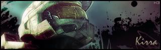
Welcome to my sig tutorial, thanks for checking it out! This will teach you to make this sig:

But for starters, download the attachment at the bottom, and put the (.abr)s in Photoshop/Presets/Brushes, and the Sample Render.png wherever you want.
And remember to constantly save your document as a .PSD so you can go back and mess with the layers incase your computer/Photoshop crashes at 11pm last night when I was nearly finished....anyways, on with the tut!!!
1. Open up Photoshop, and make your Foreground Color White, and Background Color Black, like this.

2. Now, go to File->New and use these settings.

3. Now, using the "stalemateisgod" brush set, brush around your document until you get something like this.

4. Now press Ctrl+Shift+N to make a new layer. You won't see any visible changes except in the layers window *press F7 if you want to see it*.
5. Now press X to switch your colors.
6. Open the "abstract4tut" brush set and brush around until you get something like this.

7. Now that looks nice, but you're thinking "Hey, why can't it have one of those cool renders like every other 1337 sig!?" Well fear not, open the Sample Render.png, or go find one you like at www.gamerenders.com .
8. Now in the Render's window, press Ctrl+A, then Ctrl+C to copy the image.
9. Go to your Sigs' window, and press Ctrl+V. Now using the Move Tool *cursor with 4 arrows*, move the image until it's in a good looking place.

10. But oh teh noes, it looks hideous! So lets press Ctrl+Alt+D and set the Feather value to 20.
11. Now, using the Lasso tool *looks like a Lasso*, trace in the general area around your render, and you should get a box around your render. Now go to Layer->Add Layer Mask->Reveal Selection. You might want to experiment a few times until you get something that looks good.

12. But oh teh noes again, wheres the color!!!!? Go to Layer->New Adjustment Layer->Color Balance. Mess around with the colors until you get something you like.

13. Most sig tutorials would just say put some text and a border on and your done! But we're going to make your sig multicolored, why, because it's 1337, duh! So on your Color Balance Layer, do a Filter->Render->Clouds, and you should now see something like this.

13.5 Now remember, you don't want to have colors that look nasty together, so pick 2 colors from this wheel that are "connected".
You can also use this site for a more detailed color selection.

14. But that looks bad, right? So now, we're going to add ANOTHER Color Balance Layer *Layer->New Adjustment Layer->Color Balance*. You can even do another Filter->Render->Clouds, and add a 3rd one, but most look fine with just 2.

15. This step's optional, but if you want, you can do it. Open the Tippy_Stardust_2 brush set, and brush around in White *set your Foreground color to white* until you get some good looking stars. Don't over do it or else it'll look bad.

16. Now from here on, it's all your own personal ideas! You can do a 3 pixel border, tech border *hey, I have a tut on that here!*, or a 1 pixel border, I'll explain how to do each one in order of Difficulty.
3 Pixel Border
1. Ctrl+Shift+N to make a new layer.
2. Press Ctrl+A to select everything on that new layer.
3. Go to Edit->Stroke and set the Width to 1, Color to Black, and Inside.
4. Go to Edit->Stroke and set the Width to 2, Color to White, and Inside.
5. Go to Edit->Stroke and set the Width to 3, Color to Black, and Inside
6. Now set the Blending Mode to Soft Light or Overlay.
Example:

For a 1 Pixel Border, stop at Step 3.
Tech Border
How nice, someone already wrote one.
And for text, just go to www.dafont.com and download some that you think look nice, for a Pixel *small that looks nice* font, I recommend Serious. Good luck, and post your results!
(The text there is an example...that is not a good example of text.)
Shown above is the effect of putting your text to Pin Light with different colors, feel free to experiment!


![[x]](http://img255.imageshack.us/img255/3713/fearck7.jpg)
![[x]](http://img246.imageshack.us/img246/8220/rb6vzo3.jpg)
![[x]](http://img504.imageshack.us/img504/7088/bustawolfrb3.jpg)