Update 2:
The font is changed is it ok now or do it still need work?
Update 1:
I hope it is better now the > is out of it
normal:
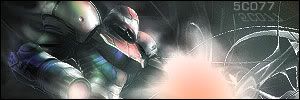
i made a new sign what do you think of it?
New sig updated 2 times plz leave a comment
-
[NpM]-canno
- Posts: 295
- Joined: Sun Jun 11, 2006 9:32 am
- Location: The Netherlands
- Contact:
New sig updated 2 times plz leave a comment
- Attachments
-
- Font changed > is out of it
i hope it's better now - [NpM]-canno 1.JPG (27.89 KiB) Viewed 1147 times
-
- new one removed the >
- this one3.JPG (6.3 KiB) Viewed 1166 times
-
- old one with >
- this one.jpg (10.9 KiB) Viewed 1210 times
Last edited by [NpM]-canno on Sat Jun 24, 2006 6:31 am, edited 6 times in total.


When your PC don't work anymore trow it out of the window why should they else call it windows.
-
CloudStrife1100
- Posts: 252
- Joined: Sat Apr 23, 2005 8:07 pm
- Location: CAMPPEN
Besides it being a picture with text, here's whats wrong with it:
The sky you have cropped is blurry and there is a symbol there ( the >
formed by the clouds ) that throws you off and kills the depth.
and your text is green. Against red clouds.
Do you know what contemporary colors are? That means they are exactly
opposite of each other. Red and green are examples.
so fix those things and you have no border, then you may have something
to look at.
rating:
||||||||||
-Cloud

-
[NpM]-canno
- Posts: 295
- Joined: Sun Jun 11, 2006 9:32 am
- Location: The Netherlands
- Contact:
-
CloudStrife1100
- Posts: 252
- Joined: Sat Apr 23, 2005 8:07 pm
- Location: CAMPPEN
-
[NpM]-canno
- Posts: 295
- Joined: Sun Jun 11, 2006 9:32 am
- Location: The Netherlands
- Contact:
that are better programs then the programs i useCloudStrife1100 wrote:What the Hell does that matter?[NpM]-canno wrote:i dont have photo shop or paintshop...
How did you make this? Did you think this into existance?
What ever you used to make this, doenst really matter what program,
you can make this better. Start by changing the text. (color, font etc.)
-Cloud
When your PC don't work anymore trow it out of the window why should they else call it windows.


-
[NpM]-canno
- Posts: 295
- Joined: Sun Jun 11, 2006 9:32 am
- Location: The Netherlands
- Contact:
-
[NpM]-canno
- Posts: 295
- Joined: Sun Jun 11, 2006 9:32 am
- Location: The Netherlands
- Contact:
-
[NpM]-canno
- Posts: 295
- Joined: Sun Jun 11, 2006 9:32 am
- Location: The Netherlands
- Contact:

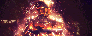
Learn how to use photoshop this is just bad to be honest. Also no need for a triple post.....[NpM]-canno wrote:THIS IS NOT A DOUBLE POST I WAITED 5 DAYS
how do i make it better????
Last edited by Xero on Thu Jun 29, 2006 10:44 am, edited 1 time in total.

Logan is dead.
-
[NpM]-canno
- Posts: 295
- Joined: Sun Jun 11, 2006 9:32 am
- Location: The Netherlands
- Contact:
if you read the topic you will see i don't have photoshopXero wrote:Learn how to use photoshop this is just bad to be honest. Also now need for a triple post.....[NpM]-canno wrote:THIS IS NOT A DOUBLE POST I WAITED 5 DAYS
how do i make it better????
When your PC don't work anymore trow it out of the window why should they else call it windows.

Then get Gimp or something, cause this sux.

I think Noobraska is a pretty cool state. eh grows corn and doesn't afraid of anythng.
(12:18:11 AM) GTAF: DAMNIT GIR WE ARE ON THE SUBJECT OF VINCE'S DICK.


-
[NpM]-canno
- Posts: 295
- Joined: Sun Jun 11, 2006 9:32 am
- Location: The Netherlands
- Contact:
did you made this from scratch if u did i think it a pretty good job.
Well even if you didn't make it from scratch it still look good but it needs some adjusments like make it look less grainy and such also text need improvment.
Try using arial font or something simple and make the color of the font a color thats in the picture.
Well even if you didn't make it from scratch it still look good but it needs some adjusments like make it look less grainy and such also text need improvment.
Try using arial font or something simple and make the color of the font a color thats in the picture.