Visit remnantmods.com for more information
Skip to content
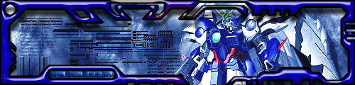
Post by halobuddha » Wed Jan 04, 2006 5:45 pm
Post by Phosphorous » Wed Jan 04, 2006 5:46 pm
Post by BEEF!!! » Wed Jan 04, 2006 5:47 pm
Phosphorous wrote:no offense, but the border is kinda ugly. Lessen the bevel.
Post by halobuddha » Wed Jan 04, 2006 5:50 pm
Post by Phosphorous » Wed Jan 04, 2006 5:59 pm
Post by halobuddha » Wed Jan 04, 2006 6:27 pm
Post by wes » Wed Jan 04, 2006 7:26 pm
Return to “GFX”