Wanna show off your Sig/Avatar/artwork. Well this is the place to do it!
lxNicktardxl
Posts: 995 Joined: Mon Sep 26, 2005 5:41 pmLocation: I get around...
Post
by lxNicktardxl Sat Dec 31, 2005 3:40 pm
How do I make a line of text follow a curve? A good curve at that. I tried liquifing. (worst idea ever). then to warp. (another bad idea). Please help.
Signature exceeded 75KB.
Patrickssj6
Posts: 5426 Joined: Sat Jul 24, 2004 12:12 pmLocation: I'm a Paranoid
Contact:
Post
by Patrickssj6 Sat Dec 31, 2005 3:57 pm
Try twirl
j/k
Just make each letter individua and then rotate and position them
...left for good
RaVNzCRoFT
Posts: 6208 Joined: Mon Jan 10, 2005 3:05 pmLocation: Raleigh, North Carolina, USA
Post
by RaVNzCRoFT Sat Dec 31, 2005 4:01 pm
No.
Layer > Type > Warp Text. Then mess around with various warp options.
lxNicktardxl
Posts: 995 Joined: Mon Sep 26, 2005 5:41 pmLocation: I get around...
Post
by lxNicktardxl Sat Dec 31, 2005 5:09 pm
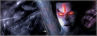
It needs something...but...what?
Signature exceeded 75KB.
wes
Posts: 3839 Joined: Thu Apr 21, 2005 5:22 pm
Contact:
Post
by wes Sat Dec 31, 2005 5:11 pm
a kickass quote?
RaVNzCRoFT
Posts: 6208 Joined: Mon Jan 10, 2005 3:05 pmLocation: Raleigh, North Carolina, USA
Post
by RaVNzCRoFT Sat Dec 31, 2005 5:11 pm
Better text blending?
lxNicktardxl
Posts: 995 Joined: Mon Sep 26, 2005 5:41 pmLocation: I get around...
Post
by lxNicktardxl Sat Dec 31, 2005 5:15 pm
wes wrote: a kickass quote?
I hate making quotes. I can never think of good ones.
RaVNzCRoFT wrote: Better text blending?
You all know I really have NO skill in that. I dont know what to do to "blend" it more.
Signature exceeded 75KB.
wes
Posts: 3839 Joined: Thu Apr 21, 2005 5:22 pm
Contact:
Post
by wes Sat Dec 31, 2005 5:22 pm
i have a quote for u
"jks =
teh master "
or mb, "dark conscience"
RaVNzCRoFT
Posts: 6208 Joined: Mon Jan 10, 2005 3:05 pmLocation: Raleigh, North Carolina, USA
Post
by RaVNzCRoFT Sat Dec 31, 2005 5:26 pm
Or maybe, "Read text blending tutorials for the thousandth time!!!!!!!!".
lxNicktardxl
Posts: 995 Joined: Mon Sep 26, 2005 5:41 pmLocation: I get around...
Post
by lxNicktardxl Sat Dec 31, 2005 5:36 pm
Nice quote.
RavnZ as we speak I am looking for tutorials. I dont see any blending all I see are tutorials on how to give the text texture. NONE on blending!
Signature exceeded 75KB.
Patrickssj6
Posts: 5426 Joined: Sat Jul 24, 2004 12:12 pmLocation: I'm a Paranoid
Contact:
Post
by Patrickssj6 Sat Dec 31, 2005 5:49 pm
Nick call him Ravy,Ravn
or dickhead(Ravy don't kill me ...left for good
Dr.Cox
Posts: 4027 Joined: Fri Jun 24, 2005 5:48 pmLocation: Beaverton, Oregon.
Contact:
Post
by Dr.Cox Sat Dec 31, 2005 6:05 pm
The_Hushed_Casket wrote: lxNicktardxl wrote:
Me likey, that's one of your best yet.
except for the horible text that he uses in all his sigs....
Cuda
Posts: 5725 Joined: Tue Oct 18, 2005 2:59 pmLocation: Torrance, CA
Post
by Cuda Sat Dec 31, 2005 6:11 pm
change text color to white, add a 2 px black stroke in Blending options, duplicate the layer, set layer style to overlay.
lxNicktardxl
Posts: 995 Joined: Mon Sep 26, 2005 5:41 pmLocation: I get around...
Post
by lxNicktardxl Sat Dec 31, 2005 6:17 pm
Cuda wrote: change text color to white, add a 2 px black stroke in Blending options, duplicate the layer, set layer style to overlay.
Now thats what I'm talking about. Hold on.
How's this?
Signature exceeded 75KB.
Cuda
Posts: 5725 Joined: Tue Oct 18, 2005 2:59 pmLocation: Torrance, CA
Post
by Cuda Sat Dec 31, 2005 6:24 pm
pixel font looks great with this tecnique. Well about the sig, at least its blended. But try adding the text in a lighter area.
lxNicktardxl
Posts: 995 Joined: Mon Sep 26, 2005 5:41 pmLocation: I get around...
Post
by lxNicktardxl Sat Dec 31, 2005 6:50 pm
GreenbayGeneral wrote: except for the horible text that he uses in all his sigs....
I dont use the same font. I get different ones. They look similar because I like the same style. It's exactly like what happened to Ravn.
Signature exceeded 75KB.
Dr.Cox
Posts: 4027 Joined: Fri Jun 24, 2005 5:48 pmLocation: Beaverton, Oregon.
Contact:
Post
by Dr.Cox Sat Dec 31, 2005 6:56 pm
lxNicktardxl wrote: GreenbayGeneral wrote: except for the horible text that he uses in all his sigs....
I dont use the same font. I get different ones. They look similar because I like the same style. It's exactly like what happened to Ravn.
true... but un like ur text his actually looks good in a sig
lxNicktardxl
Posts: 995 Joined: Mon Sep 26, 2005 5:41 pmLocation: I get around...
Post
by lxNicktardxl Sat Dec 31, 2005 7:19 pm
GreenbayGeneral wrote: true... but un like ur text his actually looks good in a sig
Thanks.
.Text just isnt my thing. ok!
Signature exceeded 75KB.
RaVNzCRoFT
Posts: 6208 Joined: Mon Jan 10, 2005 3:05 pmLocation: Raleigh, North Carolina, USA
Post
by RaVNzCRoFT Sat Dec 31, 2005 9:59 pm
The text in the updated one is a little bit better.
And yes Pat, I saw the fireworks on Vivid Abstractions. Nice Javascript!


