Page 1 of 1
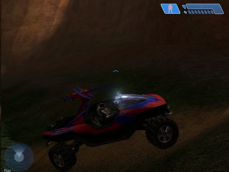
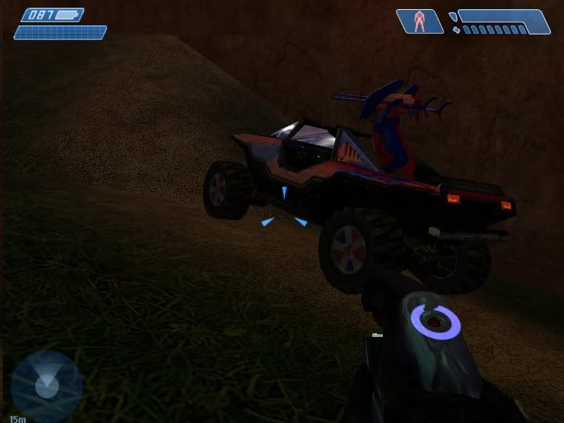
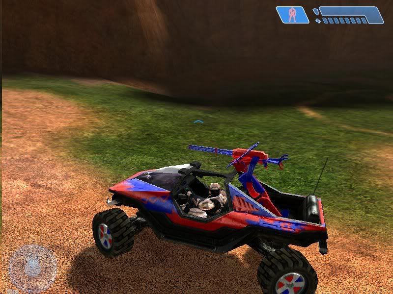
(skin) Unibiased Warthog Skin
Posted: Thu Jan 03, 2008 10:56 am
by dmanbiker
Posted: Thu Jan 03, 2008 11:02 am
by SL!P
A bit too flashy for my tastes. Besides, most of the skin doesn't fit the shape.
It's ok
6.5/10
Posted: Thu Jan 03, 2008 1:34 pm
by hell_knight
LOL!
8/10
Posted: Thu Jan 03, 2008 1:51 pm
by Darkness202
its not bad i like it 7.5/10
Posted: Thu Jan 03, 2008 2:12 pm
by UPS
Random and uneven.
4/10
Posted: Thu Jan 03, 2008 2:45 pm
by Daemon
that looks bad, sorry, i think its more just my taste in colours though because i dont like red and blue together.
why did you take screenshots in the shadows?
Posted: Thu Jan 03, 2008 2:54 pm
by Pepsi
for my personal taste it seems a little "busy" and unorthodox in a way..
BUT!!!...
you kept the theme going from the turret to the rims so i give a 8/10 for consistency.
Posted: Thu Jan 03, 2008 3:03 pm
by dmanbiker
Daemon wrote:
why did you take screenshots in the shadows?
My monitor is a little bright so the glare was huge coming off the body and I couldn't see the skin well enough to take a good screenshot out of the shadow. I should have probably not taken them on bg, but I love bg so hehe.
Posted: Thu Jan 03, 2008 3:18 pm
by Daemon
looks better in th sunlight

7/10
Posted: Thu Jan 03, 2008 3:32 pm
by hell_knight
Daemon wrote:that looks bad, sorry, i think its more just my taste in colours though because i dont like red and blue together.
why did you take screenshots in the shadows?
so u hate spiderman?
Posted: Thu Jan 03, 2008 3:42 pm
by Daemon
no but.... dammit, kinda condradicting myself here coz i mades a spiderman skin... but that was red and white!
i dont like red and blue on the warthog... hows that

Posted: Thu Jan 03, 2008 4:15 pm
by hell_knight
lol better